Understanding P3 Color Profile: A Comprehensive Guide to Color Management
Introduction
Have you ever wondered why colors can appear differently on different devices? Why does that vibrant teal on your computer screen look washed out on someone else’s? The answer lies in the world of color profiles. In this comprehensive guide, we will explore the P3 color profile, its key differences from the sRGB color profile, and the concept of color management. By the end of this article, you will have a solid understanding of color profiles and how they impact your designs.
What are Color Profiles?

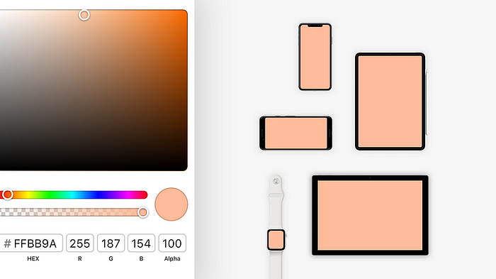
Before diving into P3 and sRGB color profiles, let’s first understand what color profiles are and why they matter for designers. Color profiles help standardize how colors appear across different screens. Each screen has its unique minimum and maximum level of vibrancy, which can affect how colors are displayed. Color profiles define the range of colors that can be accurately reproduced on a specific device. They ensure consistent color representation across various devices, such as smartphones, tablets, and desktops.
The Difference Between sRGB and P3 Color Profiles

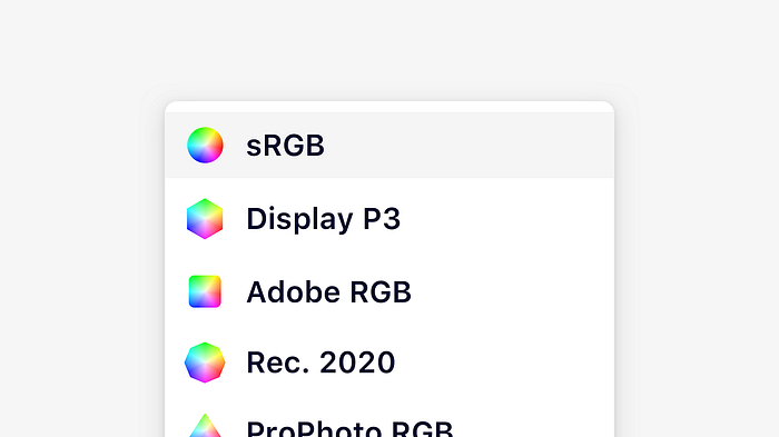
Now that we have a basic understanding of color profiles, let’s take a closer look at the two most common color profiles: sRGB and P3. sRGB has been the standard color profile since the mid-90s. It is based on the RGB color model, which uses red, green, and blue to produce a wide range of colors. Almost all devices, including smartphones, TVs, and desktops, support the sRGB color profile.
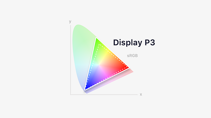
On the other hand, P3 is a newer color profile introduced by Apple. It is based on the same RGB color model but offers a wider color gamut than sRGB. A color gamut refers to the range of colors that can be reproduced by a device. P3 color gamut is approximately 25% larger than sRGB, allowing for more vibrant and accurate color representation. It was initially introduced with the first iMac to feature a Retina Display and has since been adopted by many newer devices with wide gamut displays.

Choosing the Right Color Profile
The choice between sRGB and P3 color profiles depends on various factors, including the type of design you are working on and the target devices. sRGB is a safe choice for web design and designing for a wide range of devices. It is widely supported and ensures that your colors will appear consistent across different screens.


However, if you are designing apps that heavily rely on visuals, such as photos and videos, or targeting newer devices with wide gamut displays like the latest Macs and iPhones, using the P3 color profile provides a more accurate and vibrant color representation. It allows you to take full advantage of the device’s capabilities and ensures that your colors appear exactly as intended.
Applying Color Profiles in Design Tools
To apply color profiles in design tools like Sketch, you have several options. In Sketch, you can easily switch between sRGB and P3 color profiles. In the Mac app, you can head to File > Document Settings… > Canvas and choose a color profile from the dropdown menu. This allows you to design with the desired color profile and preview how it will appear on different devices.
It’s important to note that when designing in P3, you need to have a wide gamut display to accurately visualize the colors. If your display does not support the P3 color gamut, the colors may appear differently than intended.
Color Profiles in Web and Mobile Development
In web development, the default color profile is usually sRGB. CSS and SVG, the standard web design languages, assume the sRGB color profile. However, with the advancement of web technologies, future specifications may allow for the use of other color spaces, such as P3. This would enable web designers to take advantage of wider gamut displays and create more vibrant and accurate color schemes.
In mobile app development, both iOS and Android platforms also default to the sRGB color profile. However, newer devices support wider gamut displays and allow for the use of P3 color profiles. It’s important to consider the target devices and their color capabilities when choosing the appropriate color profile for mobile app design.
Color Management for Images and Videos
Color management is not limited to single color values; it also applies to images and videos. When working with images and videos, it is crucial to embed the correct color profiles to ensure consistent color representation across different devices. If no color profile is embedded, it is generally assumed to be in the sRGB color space.

It’s worth mentioning that user interface images often omit embedded color profiles to save disk space and because their behavior without a profile is well-known. However, for more accurate and consistent color reproduction, it is recommended to embed color profiles in images and videos.
The Future of Color Profiles
With the increasing availability of wide gamut displays, color management is becoming more important than ever. Designers and developers need to be aware of the color spaces they are working with and set up their environments accordingly. As technology advances, we can expect to see wider adoption of color profiles beyond sRGB, allowing for more vibrant and accurate color representation across various devices.

Conclusion

Understanding color profiles, such as the P3 and sRGB color profiles, is essential for achieving consistent and accurate color representation in your designs. By choosing the right color profile and applying it correctly in your design tools, you can ensure that your colors appear as intended across different devices. As technology continues to evolve, color management will play an increasingly significant role in the world of design and development. Stay tuned for more updates and advancements in color profiles and color management practices.
Remember, colors are not just about aesthetics; they are a way to communicate emotions, convey messages, and create engaging user experiences. With a solid understanding of color profiles, you can take your designs to the next level and captivate your audience with stunning visuals.
Now, go ahead and explore the world of color profiles. Embrace the possibilities they offer and let your creativity shine through vibrant and accurate colors!
Additional Resources:
